Dot Dot Dot Stationery
UI | UX | Prototyping

For our term 2 course, UI/UX Strategy, we were tasked to design and create 2 high-fidelity prototypes of a fictitious company of our choice: 1 desktop in Adobe XD, and 1 mobile in Figma. After, we conducted user testing with our peers to test the design, and then implement any revisions based on user feedback. I took this chance to create Dot Dot Dot Stationery, an online stationery store.
Timeline
- June — Aug 2022
Software
- XD, Illustrator, Figma
Overview
The 2 prototypes were split into 2 projects — a desktop prototype and a mobile prototype of the same company. Each project contained 2 phases:
- 1) Prototype Creation (User persona and scenario, user flow, and wireframes)
- 2) User Testing and Revisions (Final summary report of the phases and findings)
Why Stationery?
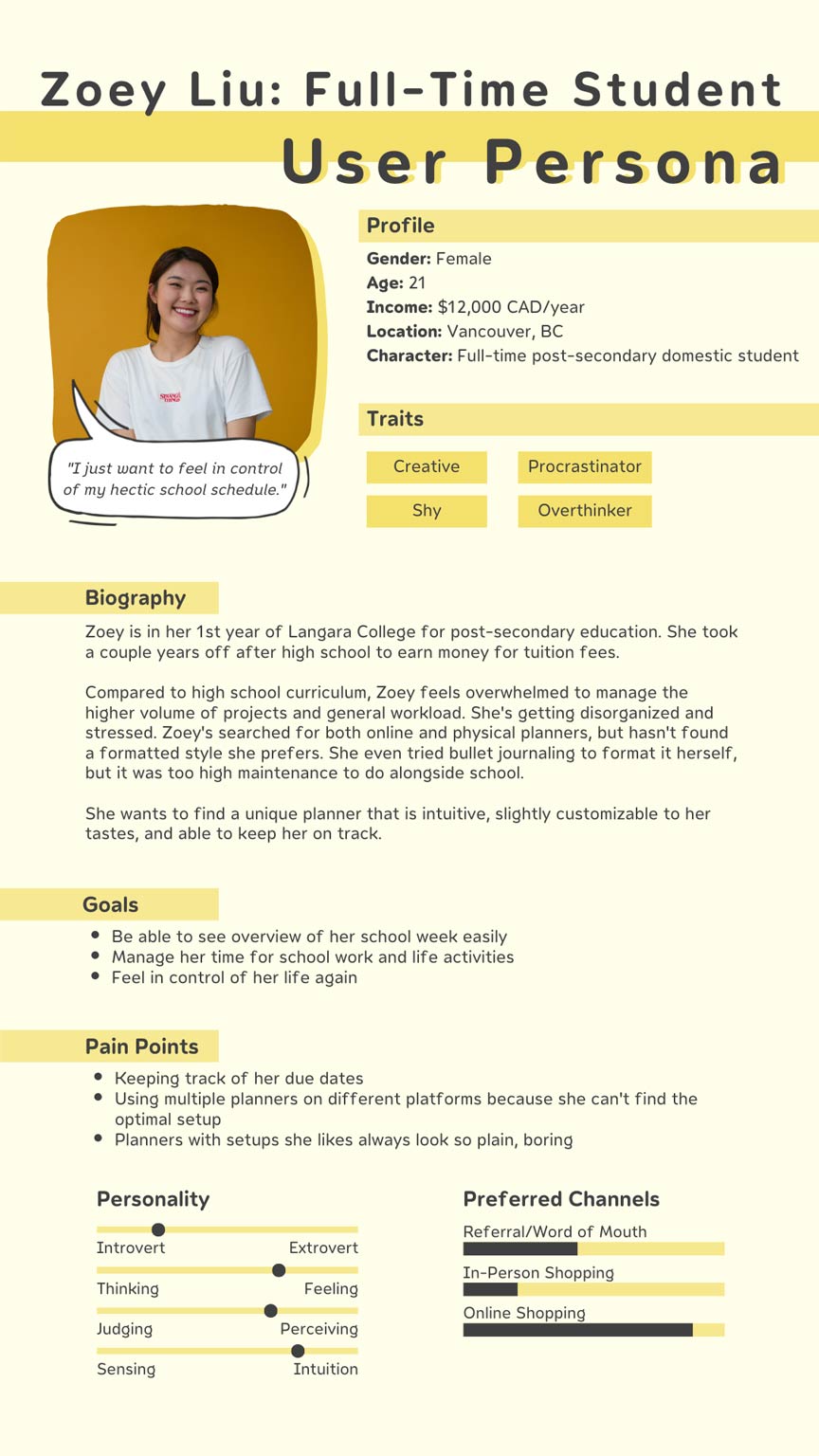
During this time in my studies, I was overwhelmed while trying to keep up with 9 courses! I was using a physical agenda, Google Calendar, a time-tracking app called Shovel, and Microsoft To-Do. Then, some tasks I listed weren't on other planners, and I got confused. That's when the epiphany hit me — why not base my project around a (fictional, but real in my heart) solution?
“Express your true self with tools customized by you, for you.”
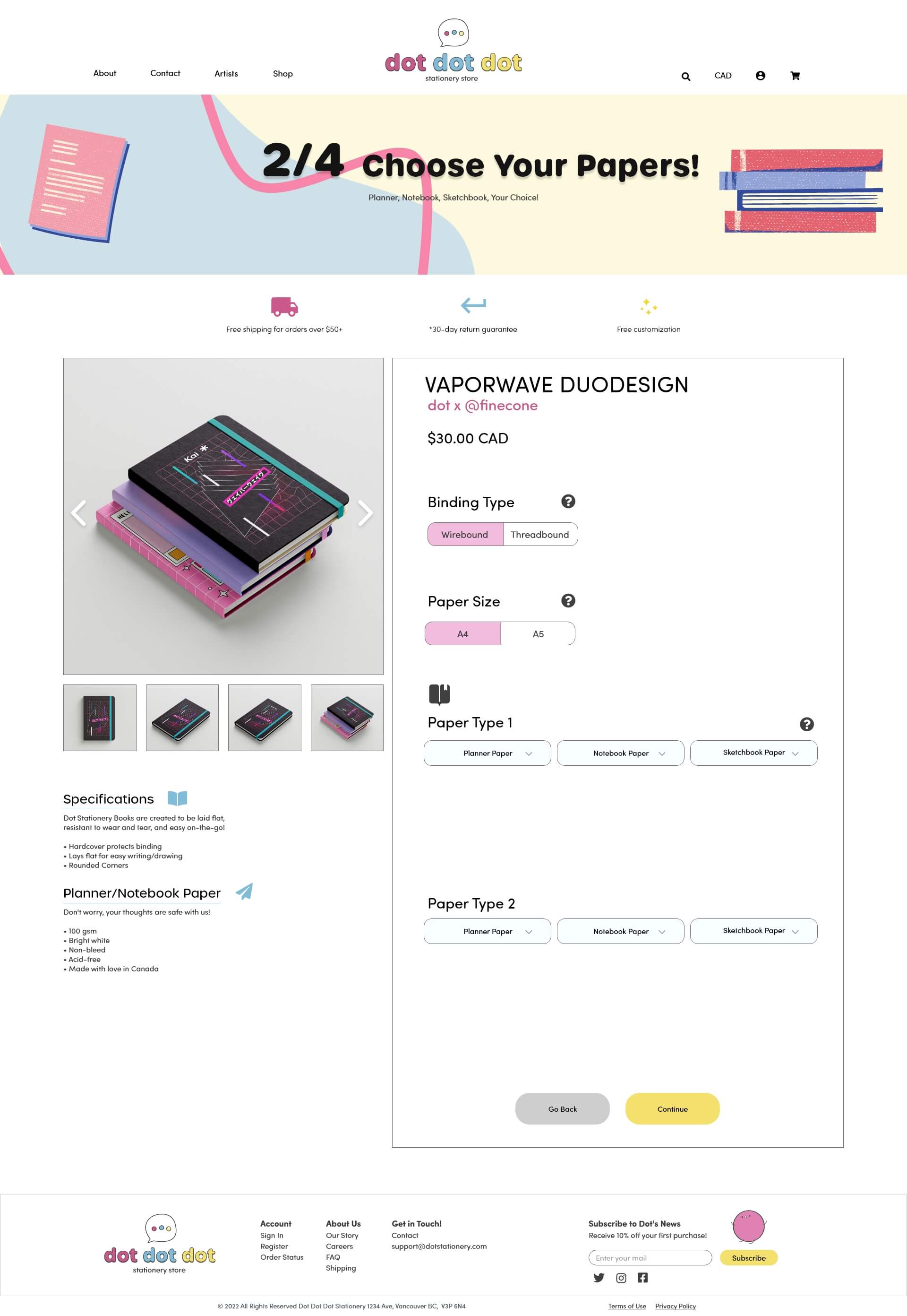
The hard part about finding a good task manager is finding the right one for your needs. I use so many types because I haven't found one in real life that works for all my needs. But Dot Dot Dot Stationery has it! Their feature product, the 'DuoDesign' book, lets people create a customized book catered to their own needs. They can mix and match the cover style, paper types, and choose to add some personal flair.
Who's this for?
At the time, I scoured through the internet to create Dot Dot Dot Stationery's ideal user. I researched on forums about 3 key questions:
- 1) Do people still use physical planners? If so, why?
- 2) Why do some people use a mix of online and physical planners?
- 3) How do people stay organized in their tasks?
I was surprised by my findings. A lot of people were like me — there wasn't 1 planner that ticked all their boxes, all the things they needed. That was understandable — at the time of research, there were a lot of pre-made planners. Although they're readily available, those planners can't plan for who's potentially buying them. As a result, people had to either spend a hefty price for customizable planners, hunt down every local stationery store near them and sift through countless agendas, or do what I do: Frankenstein different tools together to get what you want.
Those reasons are the basis of how I created the user flows for the desktop and mobile app. The desktop flow demonstrated the full DuoDesign customization and adding to cart. The mobile prototype showed the app onboarding, product screen, and saving to favorites function.
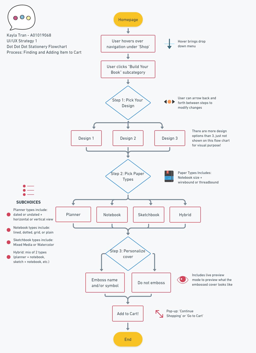
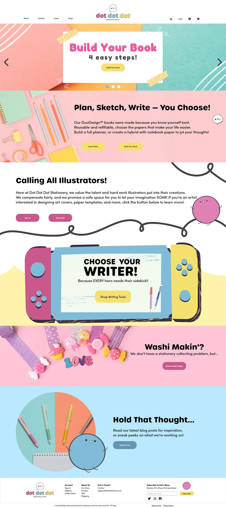
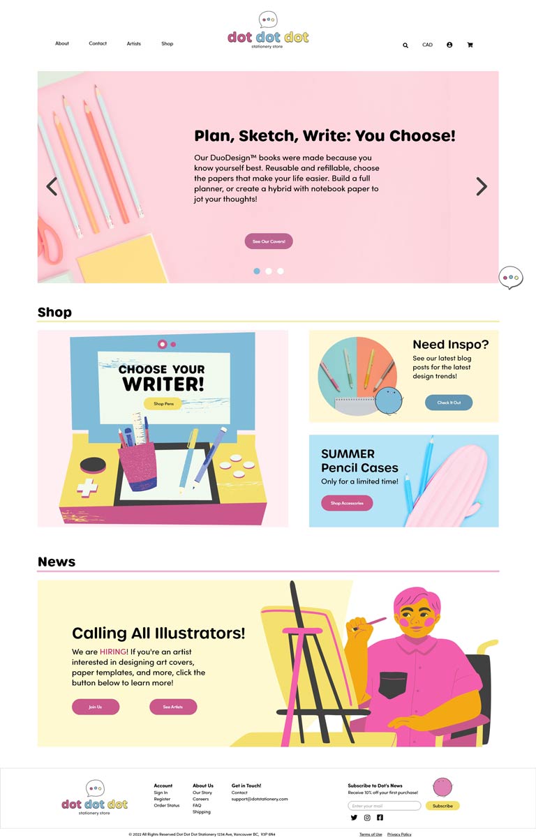
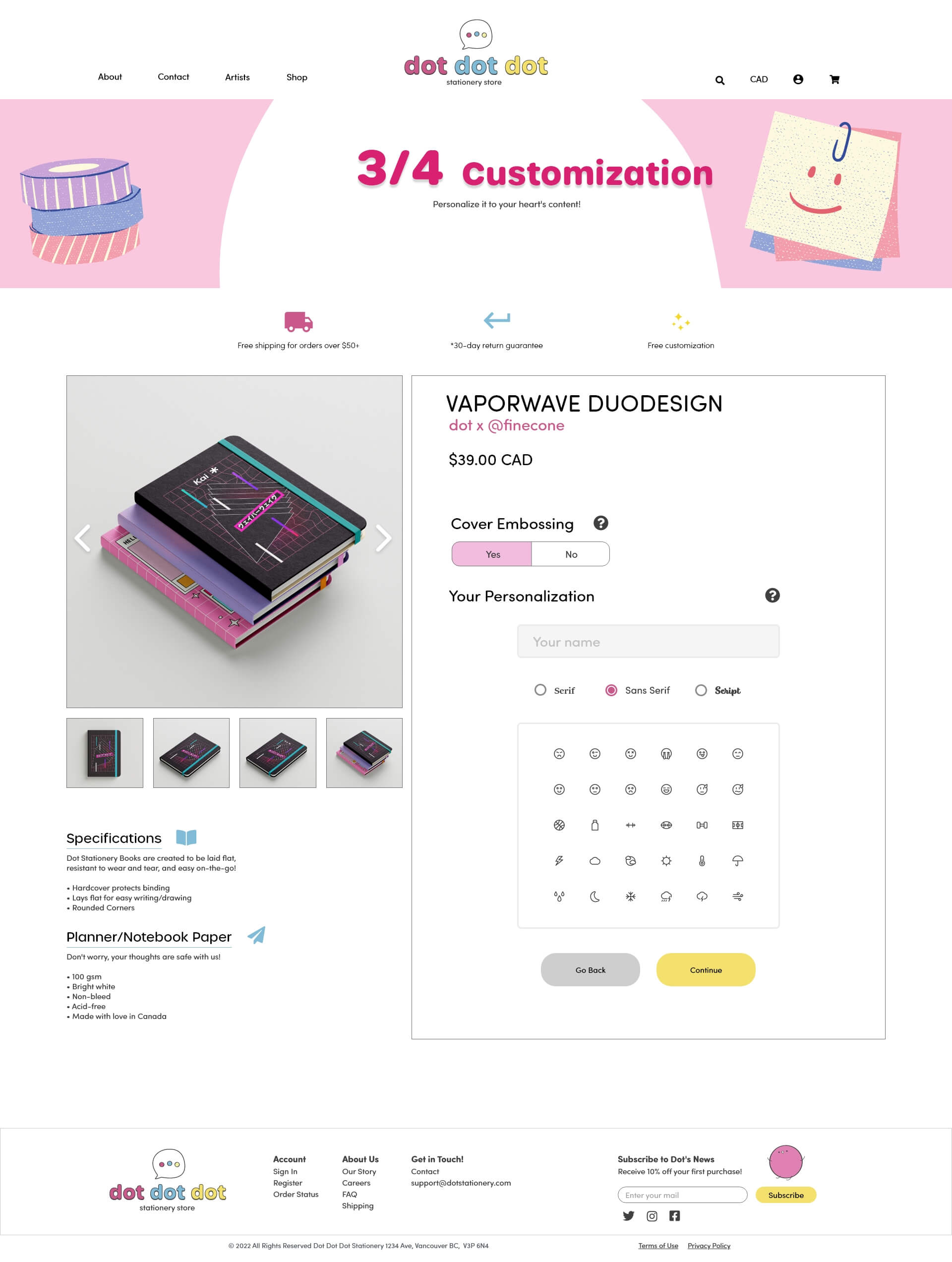
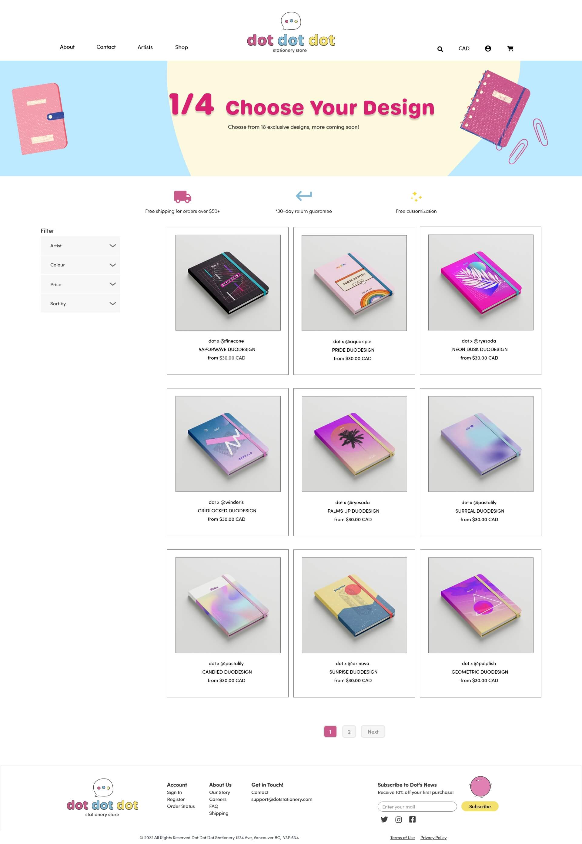
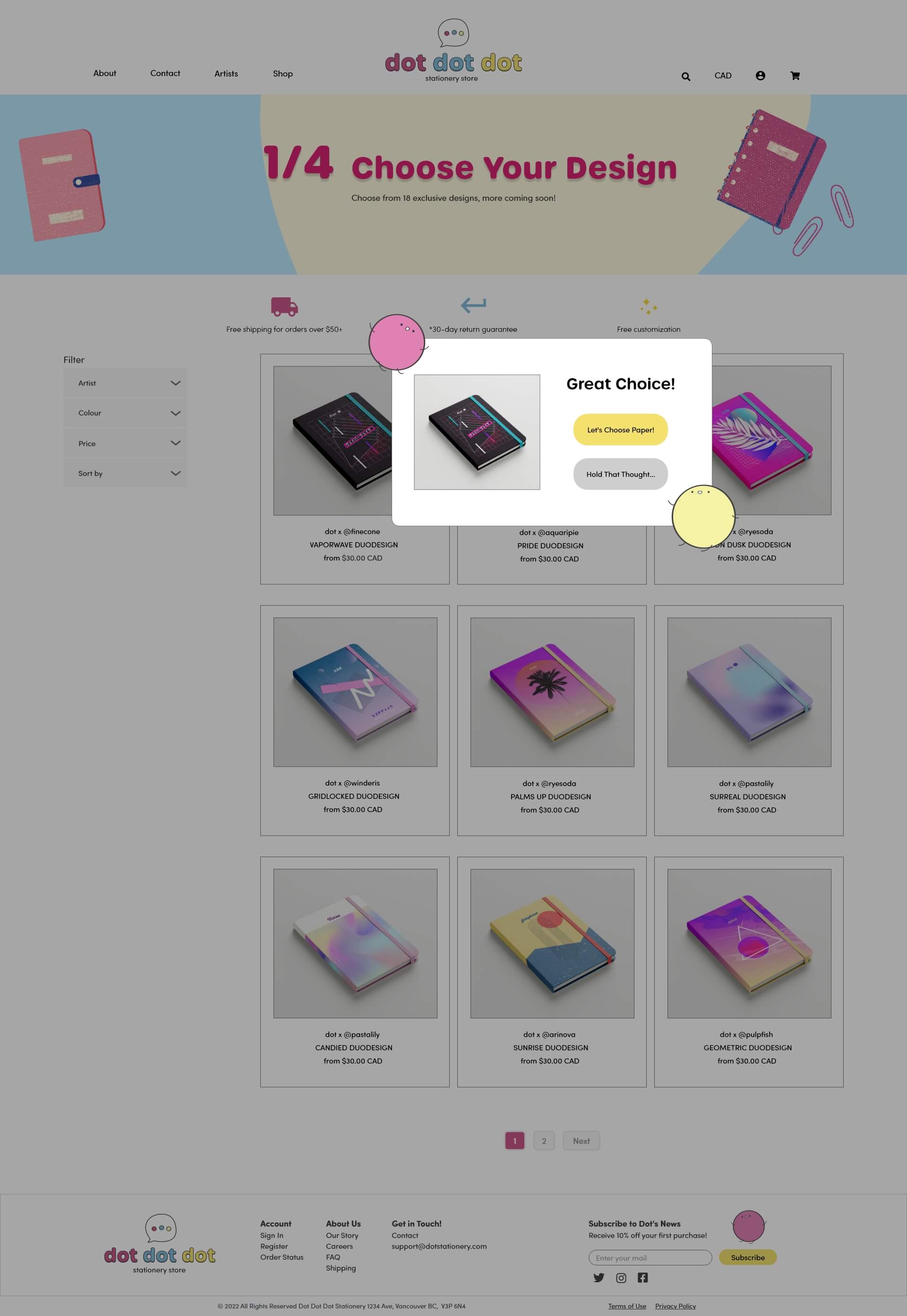
Desktop Prototype
The desktop focused on the creation of the 'DuoDesign' book. This allowed the company to see how many steps it'd take for the user. This was all created in Adobe XD.
Top prototype features:
- 1) Homepage hero slider has a call-to-action for the 'DuoDesign' books. Entice the user to solve their planner problems!
- 2) Steps shown for the customization process to let the person know how many steps there are.
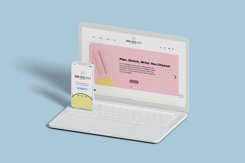
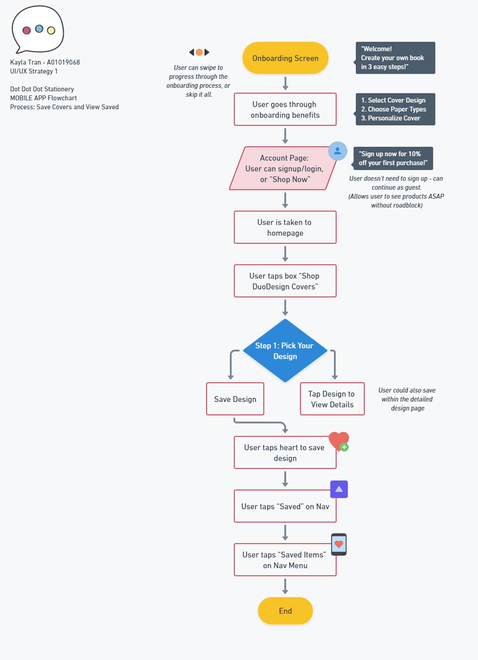
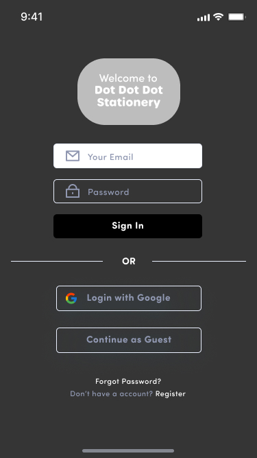
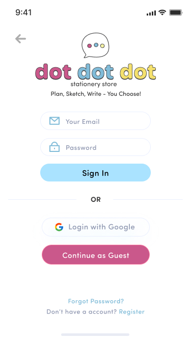
Mobile Prototype
The mobile prototype focused on the onboarding process and simplifying the steps of the 'DuoDesign' creation process for those on-the-go. It also allowed users to save their custom creations in case they're commuting and can't purchase it yet. This was all created in Figma.
Top prototype features:
- 1) Optimized the onboarding process with a “skip” button for users.
- 2) Users could continue as a guest instead of logging in. This allows them to browse products right away!
User Testing & Revisions
Desktop: 7 testers in UseBerry.
Notable feedback consisted of the homepage being visually cluttered, ambiguous category labelling, and small font size. Revisions were made from this feedback and resulted in a simplified homepage, restructuring of navigation category names, and larger font sizes to all pages.
Mobile: 7 testers in Maze.
Notable feedback included for the call-to-action buttons to stand out, as well as include more padding for finger tapping, and to add number of steps to the DuoDesign process. Revisions were made based on feedback: the call-to-action buttons were larger and used a bolder pink colour rather than muted blue, and the numbering on DuoDesign process was changed (From “1. Choose a design” to “Step ¼: Choose a design”).